Color Correction & Adjustment Tools for Photos: Colorby AI — AI Color Correction Tool for Photo Editing, Grading, and Creating Color Palettes from Images
Colorby AI is an AI-powered color correction tool that analyzes a photo's content, lighting, and mood to recommend and apply color adjustments and looks in a single tap. It helps maintain consistent color and repeatable palettes to speed editing, preserve brand or series cohesion, and move from inspiration to production without complex manual grading.
TL;DR: Colorby AI streamlines color correction and colour grading by using AI Color Match to suggest or apply looks automatically, and lets you export results as reusable LUTs and color data. Use it to extract a photo colour palette for web design, build an Adobe color palette from an image, or speed up routine correction and grading workflows.
What is color correction and why it matters
Color correction is the process of fixing color, white balance, and exposure so an image looks natural or neutral. Colour grading is the creative step that gives images a mood or consistent aesthetic.
- Technical accuracy: correct white balance and exposure ensure colors are represented truthfully across devices and print.
- Consistency: using a single palette or LUT produces consistent images across an editorial series or brand.
- Efficiency: automated tools reduce repetitive editing and turnaround time for large shoots or social schedules.
Quote-ready fact: "A predictable workflow—correct, grade, export—lets you reuse looks as LUTs and color palettes across projects."
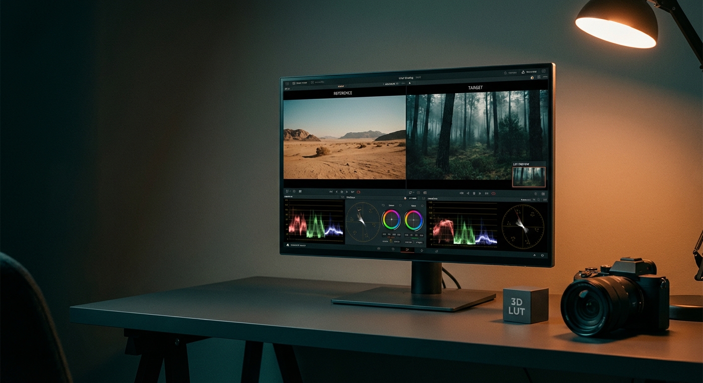
How Colorby AI works (core features)
- AI Color Match: analyzes each image for subject, lighting, and mood, then recommends a correction or graded look without needing a reference image.
- One-tap application: apply a recommended correction or style instantly; the system optimizes white balance, contrast, and color tones together.
- Exportable results: finished looks can be exported as lookup tables (LUTs) for reuse in other projects and applications.
- Palette extraction: extract dominant and supporting colors from an image to generate a color palette suitable for web design or design tools.
Concrete, quotable detail: "Colorby AI converts a photo into a reusable color palette and a LUT in a single workflow."
Practical use cases
- Portrait photographers: fast, consistent skin tones across sessions.
- Content creators: create a photo to colour palette for brand-led social posts and thumbnails.
- Web designers: extract an image palette and convert it to a web design color palette (HEX values + contrast-checked combinations).
- Video editors: export photo looks as LUTs to match footage to stills for cross-media consistency.
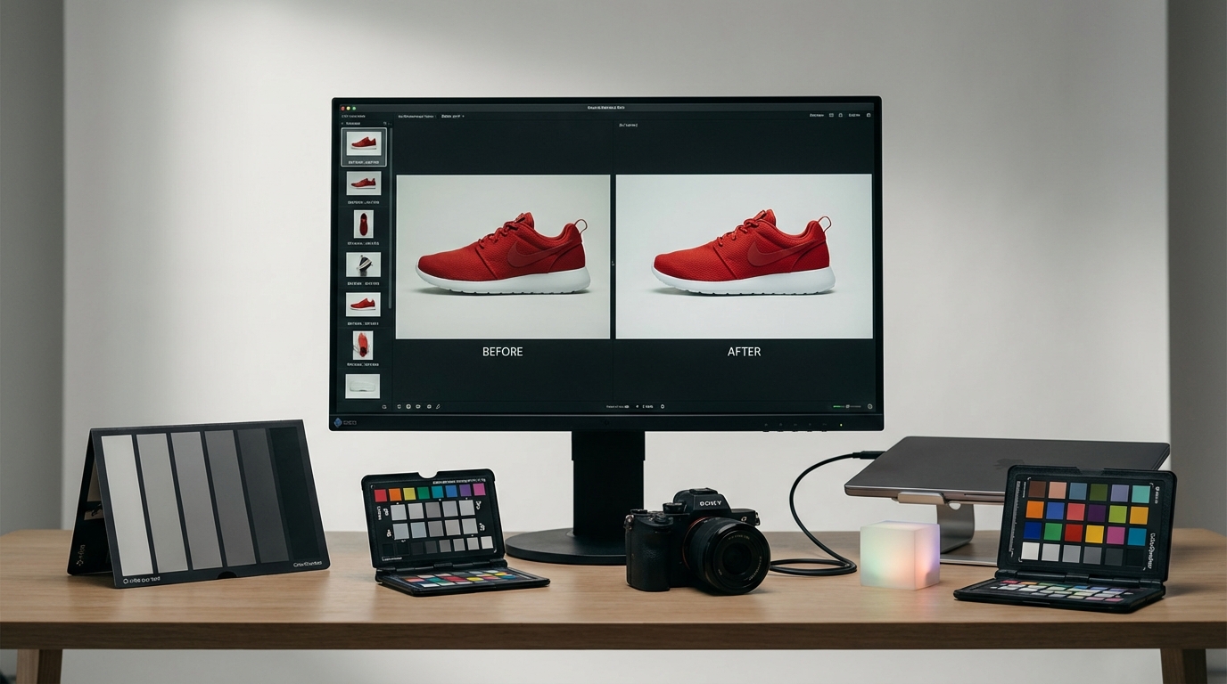
Step-by-step: create a color palette from an image (practical workflow)
- Upload the image to Colorby AI or your chosen tool.
- Let the AI analyze and apply color correction/grade (single-tap).
- Extract the palette: choose the number of swatches (3–7 recommended). The tool outputs HEX values and swatches.
- Check contrast: test primary text/background pairs for WCAG contrast (4.5:1 for normal text).
- Export: save HEX values or export to Adobe tools (upload HEX list to Adobe Color or save as ASE). Optionally export the graded look as a LUT (.CUBE) for reuse.
- Implement: add the palette to your CSS variables or design system; apply the LUT to project images for consistent visual style.
Checklist (quick):
- Correct white balance and exposure first.
- Extract 3–7 palette colors (primary, secondary, accent, neutrals).
- Verify web contrast ratios.
- Export HEXs and LUTs for reuse.
- Document palette usage in a style guide.
Concrete numbers: "Choose 3–7 colors; use 4.5:1 contrast for normal text and 3:1 for large text to meet accessibility guidelines."
Technical notes and export formats
- Color spaces: use sRGB for web and Adobe RGB or ProPhoto for print. Convert to the destination color space before final export.
- Bit depth: perform heavy color work in 16-bit where possible; export final files in 8-bit for web if required.
- LUTs and formats: exported LUTs are commonly delivered in .CUBE or other industry-standard formats for cross-application use.
- Palette formats: export HEX values for web; ASE/ACO/ASEX (Adobe swatch formats) work for Adobe apps. Import or copy HEX triplets into Adobe Color or your design tool of choice.
Quotable fact: "Exporting a graded look as a LUT (.CUBE) lets you apply the same color treatment across photo and video projects."
From photo to web design color palette — best practices
- Start with primary color: pick the dominant color that represents the brand or the image mood.
- Add one or two secondary colors: complements for interfaces or accents.
- Include neutrals: at least two—one background and one text color.
- Limit accents: reserve 1–2 bright accents for calls-to-action and micro-interactions.
- Verify accessibility: use WCAG contrast ratios (4.5:1 normal text). Tools that produce HEX pairs and contrast ratios speed this step.
Practical example:
- Photo dominant color: #6B4C9A (primary)
- Secondary: #F2C94C (accent)
- Neutral background: #F7F7F7
- Neutral text: #222222
Colorby AI vs Manual tools vs Other AI tools (comparison)
- Speed / throughput: Colorby AI — very fast (single-tap recommendations and batch pipeline); Manual — slow (precise, manual steps); Generic AI — fast but may require calibration.
- Repeatability: Colorby AI — high (LUT export for reuse); Manual — medium (requires manual replication); Generic AI — varies.
- Technical control: Colorby AI — moderate (presets + LUTs); Manual — very high (curve-level adjustments, masks); Generic AI — varies, often limited.
- Palette extraction: Colorby AI — built-in extraction; Manual — manual sampling and swatches; Generic AI — some offer extraction, quality varies.
- Integration with design workflows: Colorby AI — exports color data + LUTs for design and web; Manual — exports swatches/LUTs manually; Generic AI — mixed.
Use manual tools for absolute pixel-level control; choose Colorby AI for speed, consistency, and repeatable palettes/LUTs.
Actionable recommendations for different roles
- Photographer: build a LUT library (10–30 LUTs) representing preferred looks; apply to shoots to save 30–90 minutes per session.
- Web designer: extract HEX swatches and test contrast immediately; keep palette between 3–7 colors.
- Creative director: standardize a handful of LUTs and a palette set to guarantee campaign consistency across photographers and editors.
- Content manager: create a simple naming convention and store exported palettes/LUTs in a central asset library for teammates.
Note: the specific time-savings depend on workflow and volume—use pilot tests to measure ROI on your projects.
Frequently asked questions (FAQ)
- Q: Can AI color correction tools replace manual grading? A: No — AI tools accelerate and standardize correction and provide high-quality starting points, but manual grading still matters for highly specific or artistically precise work. Use AI for speed and consistency, and apply manual refinements when required.
- Q: How many colors should I extract from a photo for a web design color palette? A: Extract 3–7 colors: one primary, one or two secondary, 1–2 accents, and 1–2 neutrals.
- Q: Will the palette from a photo be ready for Adobe Color or Adobe products? A: Yes — extract HEX values or export Adobe-compatible swatches (ASE/ACO) and upload or import them into Adobe Color, Illustrator, or Photoshop. For graded looks, export a LUT and apply it in Adobe tools.
- Q: What contrast ratios should I check for web accessibility? A: Use WCAG guidelines: a minimum 4.5:1 contrast ratio for normal text and 3:1 for large text. Always test primary text/background pairs after you create the palette.
- Q: What file formats should I use to export LUTs and palettes? A: For LUTs, use industry-standard formats like .CUBE. For web palettes, export HEX triplets; for Adobe apps, ASE/ACO/ASEX swatch files are standard.
When to use AI color correction (decision guide)
- Use AI when you need speed, consistent branding across many images, or a rapid photo colour palette for design decisions.
- Use manual tools when you require precise mask-based corrections, selective color changes, or editorial control at a pixel level.
- Combine both: apply AI to establish a base look and then fine-tune manually for final deliveries or high-stakes prints.
Example workflow: Photo → Palette → Website
- Choose the hero image.
- Run Colorby AI one-tap correction and extract the palette (4 colors).
- Export HEX values and run automated contrast checks; adjust lightness for accessibility if needed.
- Create CSS variables and test components (buttons, headings, backgrounds).
- Export the graded hero image with the LUT applied and use the same LUT on supporting imagery for visual cohesion.
Final notes and suggested next steps
- Start by extracting palettes from 10 representative images to build a reliable palette set.
- Save at least 10 LUTs that cover your common moods (natural, warm, cool, cinematic).
- Document palette usage guidelines (primary use, accent rules, accessible pairings) so non-design teammates can apply them reliably.
Colorby AI bridges aesthetic inspiration and practical execution—use its AI Color Match and palette extraction to move faster from photo to design while keeping quality and accessibility checks part of your process. Last updated: 2026-03-10