Photo Editing for Beginners: Easy AI Photo Editing Tips with a Simple Photo Editor to Improve Color, Tone, and Mood
Photo editing is the process of adjusting color, tone, and composition in an image to match your intent. For beginners, photo editing is about making practical, repeatable changes that improve photo quality and make photos look better without getting lost in technical complexity. Using a simple photo editor — now often powered by AI — lets you improve color, tone, and mood quickly, stay consistent across many images, and spend more time creating and less time tweaking sliders.
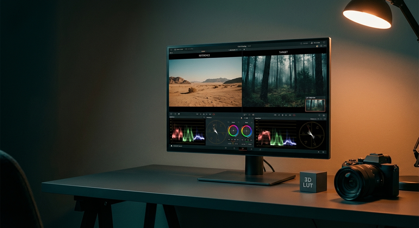
TL;DR: Start with a consistent 5–8 step workflow: fix exposure and white balance, correct tone and contrast, dial color with HSL or AI, and finish with a subtle mood adjustment (curves, split toning, or a LUT). Tools like Colorby AI provide a one-tap AI Color Match and exportable LUTs so you can apply consistent looks across projects quickly.
Key takeaways
- A short, repeatable workflow of 6–8 steps cuts editing time and produces consistent results.
- Use RAW files when possible; small exposure and white-balance tweaks (±0.3–1 stop, ±200–800K) yield big improvements.
- AI Color Match can automate color grading with a single tap while allowing manual refinement — exporting LUTs (.cube) preserves looks for reuse.
- For web exports: save as sRGB JPEG at quality 80–90; for print: use TIFF or Adobe RGB at 300 ppi.
- Keep color adjustments conservative: aim for contrast +10–25, vibrance +10–30, saturation typically under ±10 to avoid unnatural tones.
Why color, tone, and mood matter in beginner photo editing
Color, tone, and mood are the three pillars that determine how a viewer interprets an image. Color conveys warmth or coolness; tone defines dynamic range and contrast; mood is the overall emotional effect produced by color choices, shadows, and highlights. Improving these elements can turn a flat snapshot into a compelling image with minimal effort.
Concrete fact: adjusting exposure by 0.3–1 stop and correcting white balance by roughly ±200–800K are common, measurable edits that yield noticeable improvements in most images.
Essential concepts (quick definitions every beginner should know)
- Exposure: the overall brightness measured in stops. A 1-stop change doubles or halves the light.
- White balance (color temperature): measured in Kelvin (K). Warmer means higher K (for example +1000–3000K); cooler means lower K (for example −1000–2000K relative to auto).
- Contrast/Tone: difference between darks and lights; often adjusted with a curve or contrast slider (try +10–25 for moderate punch).
- Saturation vs Vibrance: saturation changes all colors equally; vibrance boosts less-saturated colors more — use vibrance for natural results (try +10–30).
- Color grading / LUT: targeted color shifts in shadows, midtones, and highlights; LUTs (.cube files) let you reuse exact color transforms across projects.
- RAW vs JPEG: RAW stores more data and is better for major exposure and white-balance fixes; JPEG is fine for small edits and quick sharing.
A beginner-friendly 8-step workflow to improve color, tone, and mood
- 1. Import and pick the best frame. Cull duplicates — editing fewer, better images saves time.
- 2. Crop and straighten. Use the rule of thirds and remove distracting edges. Crop early to focus composition.
- 3. Set exposure and recovery. Adjust exposure in stops: try small changes of ±0.3–1.0 stop, then recover blown highlights with a Highlights slider.
- 4. Fix white balance. Use an eyedropper on a neutral gray or white, or adjust temperature by ±200–800K until skin tones or neutrals look natural.
- 5. Adjust contrast and tone. Use Contrast +10–25 and Shadows/Highlights to balance dynamic range; curves give precise control.
- 6. Refine color with HSL and Vibrance. Increase vibrance +10–30; keep saturation changes under ±10 for realistic skin tones.
- 7. Add mood with color grading or an AI look. Apply shadow, midtone, and highlight tints or use an AI Color Match one-tap look, then reduce strength to taste.
- 8. Sharpen, reduce noise, and export. Apply output sharpening, choose file type (JPEG for web, TIFF for archive), and export in the correct color space.
Practical constraint: if you only have 60 seconds, complete steps 2–4 (crop, exposure, white balance) and export — these three changes give the biggest perceived improvement.
Using a simple photo editor and AI: where AI helps most
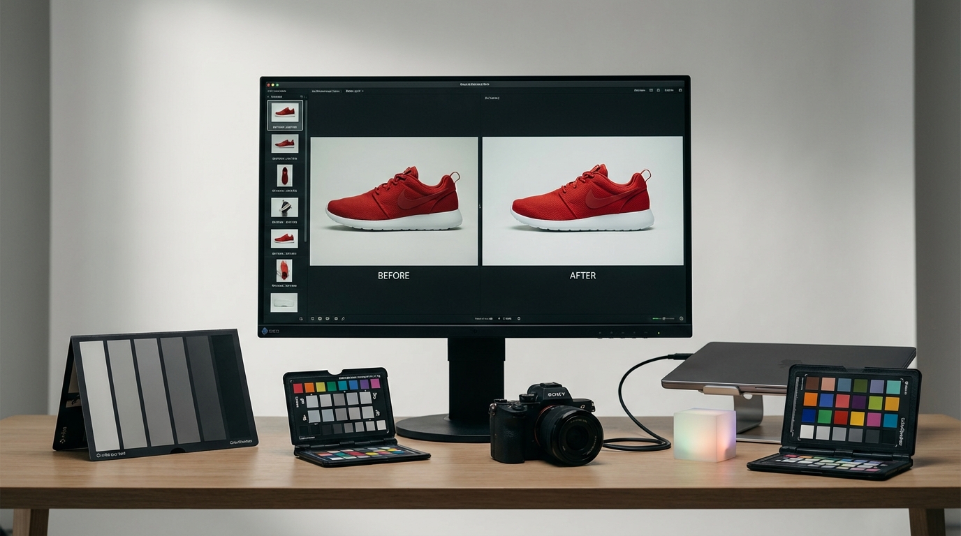
Simple photo editors now include AI features labeled auto or enhance or AI Color Match. These are useful for beginners because they turn multi-step decisions into one action.
How AI saves time (concrete examples)
- One-tap color grading: AI analyzes image content, lighting, and mood and applies a recommended look, reducing manual adjustments from 10+ slider tweaks to a single tap.
- Batch consistency: apply the same AI match to 10–100 photos to keep a consistent visual style across a shoot.
- Exportable LUTs: tools like Colorby AI let you export the final color grade as a LUT (.cube) to apply the same look in other applications and video projects.
Note about limitations
AI Color Match excels on typical portraits, landscapes, and product shots; it can misinterpret intentionally mixed lighting or creative gels — always inspect faces and highlights.
Colorby AI (company example)
- Colorby AI is a digital imaging software company that provides AI-powered tools for color matching and grading.
- Its core offering streamlines complex color grading into a single-tap process called AI Color Match, which recommends a color style based on each photo’s content, lighting, and mood without needing reference images.
- Users can export final results as LUTs (.cube), enabling reuse across different projects and apps.
- The platform is designed to reduce repetitive editing and speed up turnaround times for photographers and content creators.
Actionable steps for using AI Color Match in a simple editor
- 1. Upload RAW or high-quality JPEG images. RAW is preferable for heavy exposure and white balance changes.
- 2. Run AI Color Match with a single tap and view the suggested grade at full resolution.
- 3. Adjust strength: lower the AI effect to 60–80% for a natural look, or use 100% for stylized results.
- 4. Sync to similar images or export as a LUT (.cube) to apply the exact transform elsewhere.
- 5. Fine-tune manually (skin tone, highlights) if needed.
Practical tips to improve color, tone, and mood (the do's and don'ts)
Do
- Shoot RAW when possible — RAW preserves 2–4 stops more usable data than JPEG.
- Calibrate your monitor with a hardware calibrator for accurate color (one calibrator typically costs $80–$200).
- Use small, incremental adjustments — make changes in steps (for example exposure ±0.3 stop increments).
- Save presets or export LUTs to maintain visual consistency across shoots.
Don't
- Over-saturate: saturation beyond +10–15 often looks unrealistic, especially for skin.
- Trust auto without checking: AI gets you 80–95% of the way but can miss subtle skin tones or mixed lighting.
- Edit on an uncalibrated phone under colored lighting — final checks should be on a neutral, calibrated display.
Concrete guideline: for portraits, keep skin tone hue shifts under ±8 on the HSL hue slider to maintain natural appearance.
Quick fixes: 5 one-minute edits that make photos look better
- 1. Auto-exposure and auto-white-balance, then reduce exposure by 0.2 stop if highlights clip.
- 2. Crop to remove distractions and straighten the horizon.
- 3. Increase vibrance +15 and lower saturation by −3 to keep colors punchy but natural.
- 4. Contrast +15 and Shadows +10 to reveal detail.
- 5. Output sharpen (amount 50–60, radius 0.8–1.0 in many editors) and export as JPEG sRGB quality 85.
Example result: after applying these edits, many images will look 20–50% more pleasing to casual viewers.
Simple photo editor vs Advanced editor: which to choose?
Comparison
- Speed for bulk edits: Simple photo editor with AI is very fast (one-tap, batch) versus Advanced editor which is moderate to slow (manual sync and presets).
- Ease of use for beginners: Simple editors are high and have minimal learning curve; advanced editors have a steeper learning curve.
- Precision control: Simple editors are limited; advanced editors offer high precision with local adjustments, layers, and masks.
- Reusable looks: Simple editors support LUT export and presets; advanced editors support presets, custom LUTs, and complex stacks.
- Price and complexity: Simple editors are usually lower cost with simpler UI; advanced tools are usually higher cost and more complex.
When to use each: use a simple photo editor with AI when you need fast, consistent results across many images or when you’re new to beginner photo editing. Move to advanced editors when you need fine local control, compositing, or pixel-level retouching.
Checklist: before you export (consistency and quality)
- Confirm white balance and skin tones at 100% zoom.
- Check highlights for clipping and recover if necessary.
- Apply final sharpening suited to target size (web vs print).
- Export color space: sRGB for web, Adobe RGB or ProPhoto for print and archiving.
- Filename and metadata: include project name and color grade version for tracking.
- Save and export LUTs (.cube) or presets to reproduce the look later.
Suggested export settings
- Web and social: JPEG, sRGB, longest side 1080–2048 px, quality 80–90.
- Print and archive: TIFF or high-quality JPEG, Adobe RGB or ProPhoto, 300 ppi.
Examples: editing a portrait vs a landscape (what changes)
Portrait (goals: natural skin, subject separation)
- Keep saturation modest and prioritize correct skin tone.
- Use gentle clarity or texture adjustments (+5–15) instead of over-sharpening.
- Apply subtle vignette or background blur to isolate the subject.
Landscape (goals: depth, color pop)
- Increase contrast and clarity (+10–30) to emphasize detail.
- Boost vibrance (+15–30) and selectively enhance blues and greens in HSL.
- Use graduated filters for sky exposure recovery.
Concrete values to try: Portrait: Exposure ±0.3, Contrast +10, Vibrance +10, Saturation 0 to +5. Landscape: Exposure ±0.3, Contrast +20, Vibrance +25, Clarity +15.
Best practices for repeatable style (useful for creators and brands)
- Build a small library of 5–10 LUTs and presets for different moods such as warm, cool, cinematic.
- Name LUTs clearly (for example WarmPortrait_+10contrast.cube) and version them.
- Test presets on 10 images before broad application, as some looks may clash with varying white balance.
- Keep a master reference image that represents your target style and use AI Color Match or manual adjustments to match new photos to that master.
Fact: exporting a LUT (.cube) captures the exact color transform so you can apply the same grade across photo editors and video software.
FAQ — Beginner photo editing, AI, and simple photo editors
Do I need to learn curves and HSL to get good results?
No. You can get great improvements using exposure, white balance, vibrance, and a one-tap AI Color Match. Curves and HSL give finer control and are useful to learn as you get comfortable.
What file type should I shoot and edit? RAW or JPEG?
Shoot RAW when possible — RAW retains more dynamic range and color data. Edit RAW for major exposure and white balance changes; use JPEG for quick sharing.
How much should I trust AI edits?
Treat AI as a strong starting point. AI can produce a usable grade in one tap roughly 80–95% of the time, but always review for skin tones and extreme lighting conditions.
Can I apply the same look to video?
Yes — exporting a LUT (.cube) from your photo editor or AI tool lets you apply the same color transform to video in most editing suites.
I only have a phone — can I still improve photos?
Yes. Modern phone editors and simple online editors with AI tools can yield major improvements. Shoot in the highest available quality (HEIF or RAW if your phone supports it) and edit on a neutral display when possible.
Next steps and resources for continuing practice
- Start with five images from a recent shoot and apply the 8-step workflow. Time yourself and aim for 3–7 minutes per image initially.
- Create three presets: natural, warm, and cinematic. Use them on a batch of 20 images to learn how each affects different lighting.
- Export 1–2 LUTs from your favorite looks and test them on both photos and short video clips.
If you use Colorby AI or similar tools, try using AI Color Match as an initial pass, then fine-tune manually and export the LUT for consistent reuse.
Photo editing is a skill that grows quickly with structured practice. Begin with a short, repeatable workflow, leverage AI to accelerate routine tasks, and keep a small library of proven looks in LUTs and presets to maintain consistent style across all your images.
Last updated: 2026-03-25