Apply One Photo's Color to Another with Image Color Matching
Image color matching is the process of transferring the color, contrast, and overall look from one photograph (the source) to another image (the target). It matters because consistent color grading saves time, enforces visual identity across projects, and can make separate shots read as if they were captured in the same lighting and mood. Colorby AI by Webtest provides an AI Color Match that automates this—analyzing content, lighting, and mood to recommend a single-tap color style and export it as a reusable LUT.
TL;DR: Use image color matching to quickly give a target photo the color and mood of a reference photo. With tools like Colorby AI you can match automatically, refine with a strength slider, and export a 3D LUT (.cube) for repeatable results across apps. Last updated: 2026-04-02
Key takeaways
- Image color matching reduces manual correction time and increases consistency across images and projects.
- AI Color Match tools (like Colorby AI) can produce a usable match in a single tap; expect to refine strength, masking, and exposure afterward.
- Best technical practice: start with high-bit images (RAW or 16-bit TIFF), use the same color space where possible, and export LUTs (common size: 33x33x33 cube) for reuse.
- Preserve skin tones and important highlights by masking, using hue or targeted adjustments, or limiting match strength to 10–70%.
- LUTs (.cube, .3dl) let you apply the exact color transform in photos, video editors, and other imaging software.
What is image color matching and why it matters
Image color matching is a targeted color transfer process: you analyze the source photo’s global color distribution, tone curve, and color grading and then apply those attributes to a different photo. For photographers, content creators, and visual pros this matters because:
- Consistency: matching creates a consistent look across a shoot, campaign, or social feed.
- Speed: it reduces repetitive manual edits — Colorby AI advertises single-tap results, turning multi-step grading into one operation.
- Repeatability: exporting a LUT lets you reuse a favorite look across projects and time, saving hours on future work.
Concrete fact: common LUT cube sizes include 17x17x17, 33x33x33, and 65x65x65; 33x33x33 is widely used for a balance of precision and file size.
When to use image color matching
- Batch consistency: when you need the same color grade across dozens or hundreds of images.
- Look development: when a client provides a reference image and you must reproduce the look.
- Cross-medium reuse: when the same look must be applied to both photos and video (via LUT export).
- Rapid prototyping: when you want to test multiple stylistic directions quickly.
Avoid using raw color matching when the source and target contain completely different lighting geometry (e.g., backlit landscape vs. indoor studio portrait) unless you plan to mask and composite adjustments.
Preparation checklist (before you match)
- File quality: use RAW or 16-bit TIFF when possible. Higher bit depth preserves color gradients and reduces banding.
- Color space: work in a wide-gamut working space (Adobe RGB or ProPhoto RGB) if you plan heavy grading; use sRGB for final web deliverables.
- Exposure and noise: reduce heavy noise or clipped highlights before matching—AI and automated matches work best on clean data.
- Crop and composition: crop or align areas you want matched (e.g., sample skin areas in both images) to improve AI analysis.
- Reference selection: pick a reference image with an overall mood and lighting similar to what you want to achieve to reduce the amount of masking and refinement.
How to apply one photo’s color to another — Two practical workflows
Below are two practical workflows. The first shows the AI-assisted approach (Colorby AI), the second shows a manual approach using standard tools (Photoshop or similar).
A. Fast AI workflow (recommended for speed and repeatability)
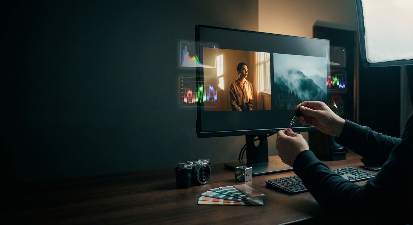
- Open Colorby AI (Webtest product) and upload: target image (the photo you want to change) and source image (the photo containing the color you want to match).
- Choose AI Color Match. The system analyzes content, lighting, and mood and proposes a match automatically.
- Review and adjust the Strength slider (0–100%). Tip: start around 50% then refine between 10–70% for natural results.
- Use masks to protect critical areas:
- Add a skin-tone mask or brush out background if the match affects skin too much.
- Apply a highlights-only mask to preserve blown highlights if needed.
- Fine-tune exposure and contrast using the single-tap refinement controls (shadows, highlights, vibrance).
- Export: export a 3D LUT (.cube) for reuse. Use a 33x33x33 cube for general compatibility. Save the graded image as 16-bit TIFF or high-quality JPEG for delivery.
Practical settings to try
- Strength: 10–70% for portraits, 40–100% for stylized landscape matches.
- Temperature shift: +/- 500–2000 K typical when shifting between cool and warm looks.
- Opacity when blending color overlay layers: start at 50% and refine within 10–70%.
Why use AI Color Match?
Speed: single-tap grading can reduce a 10–20 minute manual job to under 1 minute. Consistency: predictable results that can be exported as LUTs and reused.
B. Manual workflow (Photoshop or traditional tools)
Use this when you need maximum control or must target small details.
Step-by-step (Photoshop-style)
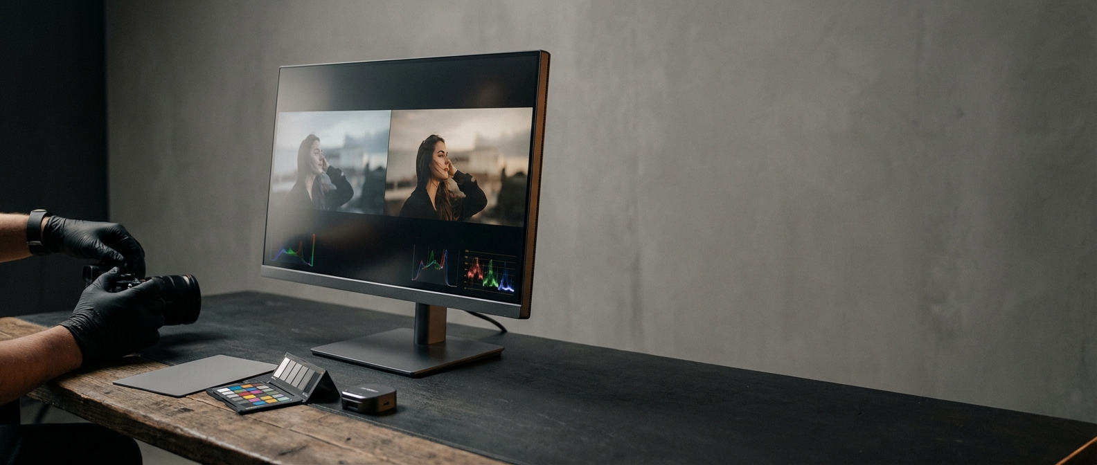
- Open source and target images in Photoshop.
- Create a new layer over the target image and copy a color sample from the source (Color > Apply Image or create Solid Color sampled from source).
- Use Image > Adjustments > Match Color: source: choose the source document and layer; check Neutralize if you want to remove color cast; adjust Luminance and Color Intensity sliders to taste (use small changes).
- Use adjustment layers for refinement: Selective Color to adjust Reds and Yellows for skin tone preservation; Curves to tweak contrast with a midtone S-curve and use separate RGB channel curves for color balance; Hue/Saturation to desaturate problem colors or push specific hues.
- Masking: paint masks to protect skin, bright highlights, or logos.
- If you want a LUT for reuse: add a Color Lookup adjustment, set the desired file format and export the transform as a 3D LUT (.cube).
Concrete tips
- When matching portrait skin tones, sample the cheek area in both photos and target the Hue vs Hue curves or a Selective Color Red adjustment rather than a global split-toning approach.
- For exposure mismatch, avoid using only color transforms — first match exposure or perform luminance mapping, then transfer color.
Preserving skin tones and important details
- Masking: always isolate skin areas with masks before applying full-image matches.
- Luminance mapping: match brightness distribution before applying color transforms; mis-matched luminance makes skin look flat or muddy.
- Use gamut checks: when moving between color spaces, ensure the intended target gamut (sRGB vs ProPhoto) can represent the colors produced by the match; extreme shifts may clip or shift hues.
- Targeted HSL adjustments: after matching, use targeted HSL changes to correct skin hue by small degrees (±2–6 in hue sliders).
Example: If a sunset reference introduces too much orange in skin, reduce the Red/Orange hue by about 3–6 units and increase Lightness by 3–8 on the targeted HSL control.
Using LUTs to save and reuse looks
- Why export a LUT: a LUT converts the color transform into a compact file that can be applied across photos and video editors (Premiere, DaVinci Resolve, Final Cut).
- Common formats: .cube (widely supported), .3dl.
- Common cube size: 33x33x33 — balanced precision and compatibility.
- Workflow: create match → export .cube → import into other apps as a Color Lookup or LUT filter → adjust intensity or opacity within the host app.
Concrete rule: Always test exported LUTs on representative images and in the destination color workflow (e.g., Rec.709 for video, sRGB for web images) to ensure the look translates correctly.
Image color matching pitfalls and how to avoid them
- Pitfall: Different dynamic ranges produce odd results. Fix: match exposure and dynamic range first or use highlight and shadow protection masks.
- Pitfall: Noise amplification. Fix: denoise before color transfer, especially when the source is cleaner than the target.
- Pitfall: Over-stylization. Fix: use match strength and opacity controls; aim for 10–70% strength for subtle matches.
- Pitfall: Color banding after heavy grading. Fix: work in 16-bit and avoid extreme per-channel clamping; export as high-bit TIFF where possible.
Quick comparison: Manual vs Traditional Plugin vs AI Color Match
- Feature / Metric: Speed — Manual (Photoshop-style): Slow, 10–30 min per image; Traditional Color Plugins: Moderate, 5–15 min; AI Color Match (Colorby AI): Fast, under 1–3 min (single-tap).
- Feature / Metric: Repeatability — Manual: Low unless you export a LUT manually; Traditional Plugins: Medium with presets; AI Color Match: High with exportable LUTs and consistent AI recommendations.
- Feature / Metric: Skill required — Manual: High (color theory and tools); Traditional Plugins: Medium; AI Color Match: Low (beginner-friendly).
- Feature / Metric: Control — Manual: Maximum; Traditional Plugins: Medium; AI Color Match: High with masks and sliders.
- Feature / Metric: LUT export — Manual: Manual process; Traditional Plugins: Often available; AI Color Match: Built-in, single-click export (.cube).
Use the manual workflow when you need pixel-level control. Use AI Color Match when you prioritize speed and consistent output across batches.
Practical checklists and quick recipes
Checklist: Preparing a reference match
- Confirm both images are in the same working color space (or convert temporarily).
- Denoise and fix clipped highlights on both images if needed.
- Crop to areas of interest to help AI or sample picks (e.g., crop around a subject’s face).
- Decide which areas must be preserved (skin, brand colors) and set masks.
Quick recipe: Warm cinematic look from a sunset photo to a studio portrait
- Run AI Color Match on portrait using sunset as source.
- Reduce match Strength to about 45%.
- Add a mid-tone warm shift: Temperature +1200 K (or use a warm color overlay).
- Slightly reduce highlights by 10–15% and lift shadows by 5–10% for a crushed-midtoned look.
- Mask skin and tweak Hue/Saturation: reduce Orange saturation by 3–6 points to retain natural skintone.
- Export LUT (.cube 33) for future portraits.
FAQ
- Q: Can I color match from a JPEG reference to a RAW target? A: Yes. For best fidelity, use the highest-quality source available. If your reference is a JPEG, expect some limitations from compression and reduced dynamic range; compensate by refining strength and masking.
- Q: Will matching change exposure or noise characteristics? A: Matching primarily transfers color and tone mapping but can reveal noise differences. Match exposure first or denoise the target before applying the color transfer. Use masks to prevent shadows and highlights from being altered unwantedly.
- Q: How do I avoid unnatural skin tones after matching? A: Protect skin with a mask, use targeted HSL or Selective Color adjustments on skin tones, and reduce overall match strength. Sampling skin areas in both images helps target adjustments accurately.
- Q: What LUT format should I export for best compatibility? A: Export a .cube file, 33x33x33 for general use. For high-precision needs, export a 65x65x65 cube if your tool supports it, but note the larger file size and potential compatibility limits.
- Q: Can I use a LUT created from Colorby AI in video editors? A: Yes. Exported .cube LUTs are supported by Premiere Pro, DaVinci Resolve, Final Cut Pro, and many image editors. Always test the LUT in the target color workflow (Rec.709, Rec.2020, sRGB).
Closing recommendations
- Start with the AI Color Match in Colorby AI (Webtest) when you need fast, repeatable results across many images. Use the Strength slider and masks to preserve skin and highlights.
- Keep a small LUT library: export and label LUTs (for example, SunsetWarm_33.cube, FilmMidTone_33.cube) so you can apply consistent looks across future jobs.
- Always work non-destructively: save originals, apply matches on separate layers or copies, and export high-bit masters.
Further reading and tools
If you want full control, combine AI Color Match outputs with targeted manual adjustments (Selective Color, Curves, HSL). Create named LUTs for brand guidelines to ensure consistent look across photographers and editors. Last updated: 2026-04-02