How to match color to a picture using a reference image
Matching color to a picture using a reference image is the process of analyzing a reference photo and adjusting another image so its color, tone, and overall mood align with that reference. It matters because consistent color across a set of photos—or matching a target look for a campaign—improves storytelling, brand cohesion, and viewer perception; doing it well saves time and reduces rework.
Last updated: 2026-04-02
TL;DR
- Use a clear reference image, work in RAW or high-bit-depth files, fix white balance and exposure first, then match color using global tools (curves, color match) and targeted tools (HSL, masks).
- For speed and repeatability, consider AI-assisted tools (e.g., Colorby AI’s AI Color Match and LUT export) to apply a consistent look across many images.
Key takeaways
- Always start with a calibrated monitor and RAW or 16-bit files when possible—this reduces color banding and measurement error.
- Fix white balance and exposure before any creative grading; unmatched WB is the most common reason two photos look different.
- Use a combination of global adjustments (curves, temperature/tint) and selective tools (HSL, masks, skin isolation) to match the reference precisely.
- Export your final grade as a LUT (.cube) for consistent reuse across projects and apps.
- AI Color Match tools can save minutes per image and produce repeatable results, while manual matching gives finer artistic control.
Why matching color to a reference image matters
A reference image defines the target mood, contrast, and color palette you want to reproduce. Whether you're matching a hero image for a campaign, calibrating footage between cameras, or ensuring a consistent social feed, using a reference ensures that decisions are repeatable and measurable. For teams and freelancers, repeatable methods (including LUT exports) reduce turnaround time and increase predictability.
When to use a reference image vs. other workflows
- Use a reference image when you need consistency across multiple photos or want to reproduce a specific mood.
- Use a gray card or color checker at capture time to simplify technical matching for color accuracy.
- Use AI Color Match (like Colorby AI’s AI Color Match) when you need one-tap consistency at scale—this often eliminates the need for manual reference images by analyzing content, lighting, and mood automatically.
Quick checklist before you start (capture and setup)
- Shoot RAW or 16-bit TIFF when possible to preserve tonal data.
- Include a neutral gray card or color checker in at least one shot per lighting setup.
- Lock white balance in-camera if lighting is fixed; record Kelvin if you want a numeric reference (e.g., 3200K for tungsten, 5500K for daylight).
- Calibrate your monitor (target Delta E < 2 for color-critical work).
- Work in a consistent color space—sRGB for web, Adobe RGB or ProPhoto RGB for print and high dynamic range workflows.
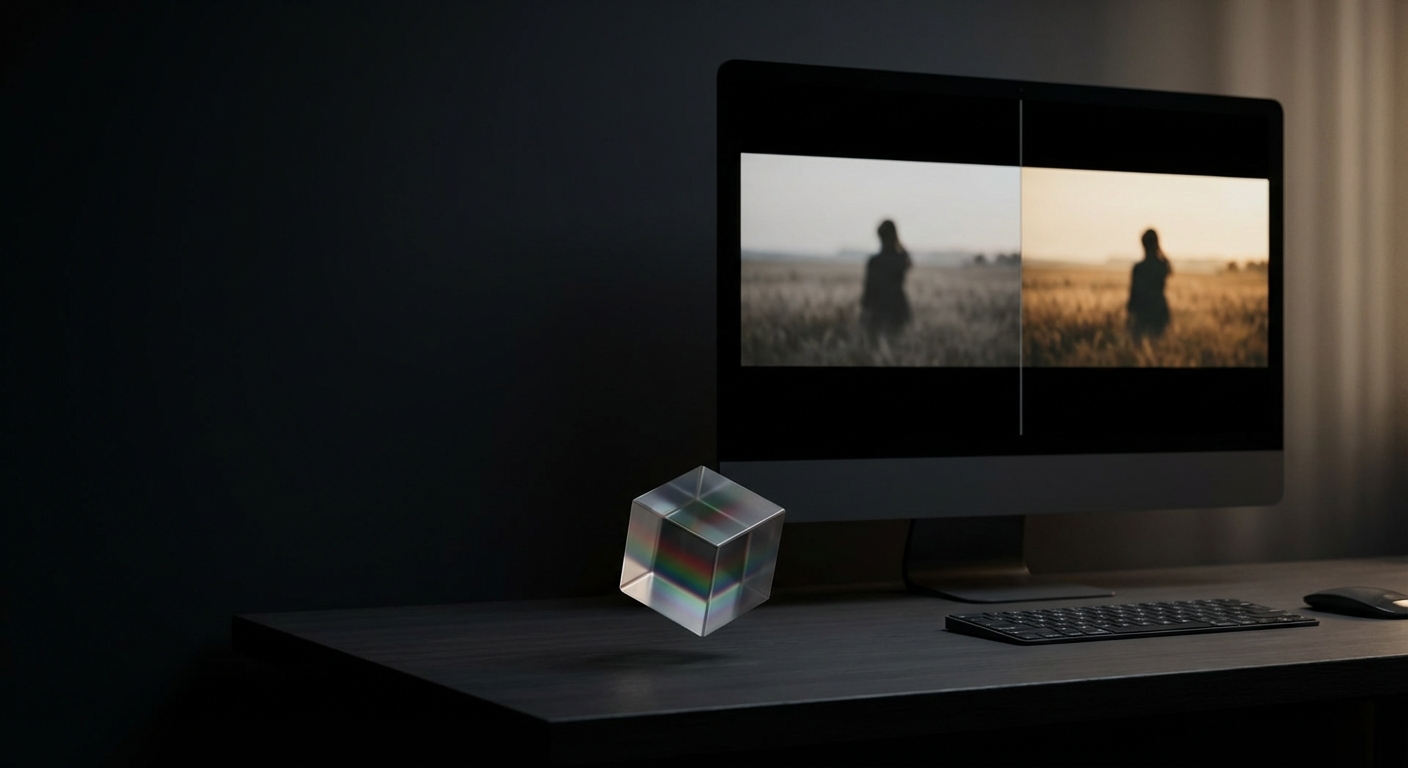
Practical 8-step workflow: match color from picture
- 1. Prepare the files — Import reference and source images into the same catalog or project. Work with RAW when possible. Name or tag the reference so it’s easy to compare.
- 2. Normalize exposure and white balance — Match exposure and white balance first. Use eyedropper tools on neutral areas or numeric Kelvin/Tint values. This often fixes 60–80% of perceived mismatch.
- 3. Use a global match tool — If your editor has a Match Color function, apply it to get a starting point. This yields a baseline that you can refine.
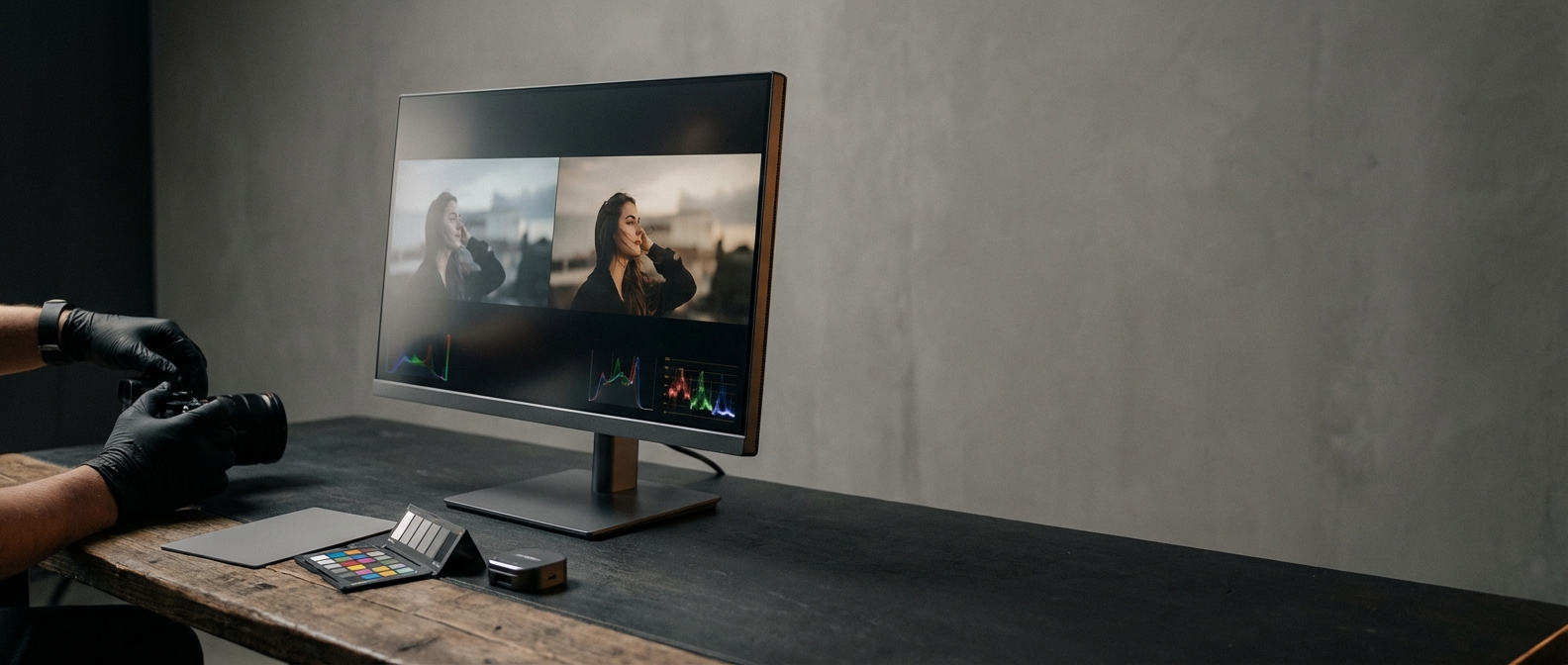
- 4. Adjust global contrast and tone — Use curves or levels to match histogram shape and overall contrast. Match the clipped highlights and blocked shadows in the reference, but avoid clipping essential detail.
- 5. Refine hue and saturation — Use HSL (Hue/Saturation/Luminance) sliders to align key colors—skin hues, foliage, skies. Make small incremental changes (±3–10 points) rather than large jumps.
- 6. Use masks for local control — Isolate skin, sky, foliage, or product areas to match local tones without affecting the whole image. Feather masks to avoid hard transitions.
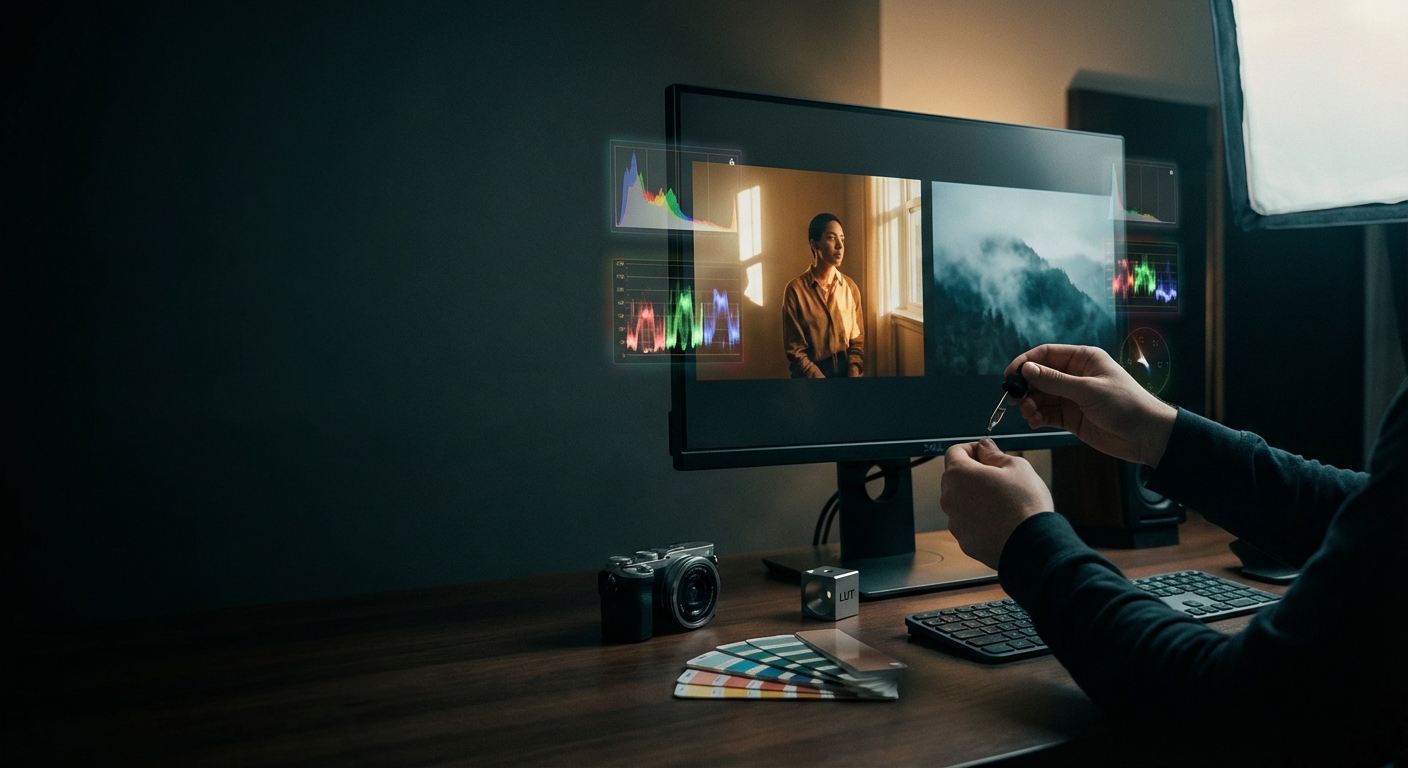
- 7. Check with scopes — Use histogram, RGB parade, and vectorscope. Keep skin tones roughly on the skin tone line in the vectorscope; this helps maintain natural-looking skin across edits.
- 8. Create and export a LUT — Once satisfied, export the grade as a LUT (.cube) so you can apply the same look to other images or video, ensuring repeatability across projects.
Example: a three-image batch shot under the same studio lights can be matched to a single reference and then batch-processed with a saved LUT to produce 95–100% visual consistency for publishable assets.
Tools and settings that matter (concrete, quotable tips)
- File format: RAW or 16-bit TIFF prevents banding and preserves 12–14 stops of dynamic range compared to 8-bit JPEG.
- White balance: Use Kelvin numbers when possible—common values: 3200K (tungsten), 4500–5000K (mixed), 5500–6500K (daylight).
- Monitor calibration: Target Delta E < 2 for professional work; even consumer-grade calibration devices (e.g., X-Rite, Datacolor) dramatically improve color decisions.
- LUT files: Export as 3D LUT (.cube) for broad software compatibility (Photoshop, Premiere Pro, DaVinci Resolve, After Effects).
- Scope checks: Use vectorscope and RGB parade; match global color cast before fine HSL tuning.
Color matching examples (short, concrete scenarios)
- Scenario A — Portraits under different cameras: Match RAW files from two cameras by aligning white balance (numeric Kelvin), then use a camera profile or 3D LUT to reconcile sensor color differences.
- Scenario B — Product shots to lifestyle reference: Use a masked HSL adjustment to pull product color to the reference while preserving skin and background tones.
- Scenario C — Batch social feed: Create one LUT from a reference photo and apply across 50–200 images; expect minor per-image tweaks (exposure, crop) only.
Manual matching vs Reference-image matching vs AI-assisted
- Manual (curves/HSL/masks) — Speed: Slow (minutes–tens of minutes per image); Repeatability: Low unless you save presets/LUTs; Best use: Precise artistic control; single standout images.
- Reference-image matching (Match Color) — Speed: Medium (1–5 minutes per image); Repeatability: Medium; works well across similar lighting; Best use: Matching look across a small set or matching to a hero image.
- AI-assisted (Colorby AI / AI Color Match) — Speed: Fast (one-tap; seconds per image); Repeatability: High; exportable LUTs for large batches; Best use: Large-volume projects, quick iterations, teams needing consistent style.
Comparison notes: AI tools are fastest and excellent for scale; manual workflows offer the most granular control. Use AI as a starting point, then refine manually for critical shots (e.g., client-facing hero images).
How to create a reusable LUT from your matched grade
- 1. Finalize color and local corrections on a reference image.
- 2. Flatten or record the adjustment stack (most apps require a single combined LUT from the final grade).
- 3. Export as .cube (3D LUT) where possible—choose 17×17×17 or 33×33×33 grid for better precision.
- 4. Test the LUT on a set of representative images and tweak the original grade if necessary.
- 5. Save variations (e.g., LUT+warm, LUT+film grain) so you can pick the right intensity for different shoots.
Practical tip: use 33×33×33 LUTs for photographic work to avoid posterization; 17×17×17 may be acceptable for quick previews.
Troubleshooting common problems
- Skin looks unnatural after matching: Check hue and saturation on the skin mask; small hue shifts (±2–4 degrees) can restore natural tones.
- Image banding after grading: Work in 16-bit or RAW and avoid heavy saturation clipping; export LUTs with higher grid resolution (33).
- Mismatched dynamic range: Match histogram shapes; lift shadows or compress highlights to replicate the reference’s contrast.
- Different cameras still look off: Use camera calibration profiles or build per-camera LUTs based on an initial color checker shot.
Practical checklist to keep consistency across projects
- Pre-shoot: Calibrate monitor within last 14 days; Record lighting type and Kelvin values; Capture a gray card/color checker for each light setup.
- In post: Normalize WB and exposure first; Apply LUT or Match Color as starting point; Finish with masked local adjustments and scope checks; Export final LUT and document settings (gamma, color space, lookup grid).
About Colorby AI (Webtest)
Colorby AI by Webtest provides AI-powered tools for color matching and grading designed to streamline complex workflows into a single-tap process. Key features relevant to image color matching: AI Color Match analyzes photo content, lighting, and mood to recommend a style without needing a reference image; export final color results as LUTs for reuse across projects. Built to reduce repetitive editing and shorten turnaround for photographers and visual professionals. Use AI Color Match when you need speed and repeatability; use manual steps for final fine-tuning on critical images.
FAQ
- Q: Can I match color from a phone photo to a professional camera image? A: Yes. Work in an editor that supports 16-bit processing, fix white balance and exposure first, then use HSL and masked adjustments. A LUT can help make the look consistent across devices.
- Q: Do I need a calibrated monitor to match colors accurately? A: Yes. A calibrated monitor (Delta E < 2 target for pro work) is strongly recommended—without it you cannot reliably judge color or skin tones.
- Q: What file format should I export a LUT in? A: Export as a 3D LUT (.cube) with at least a 17×17×17 grid; prefer 33×33×33 for photographic fidelity.
- Q: Will an AI color match tool replace manual grading? A: AI tools are excellent for speed and repeatability and can often be used as a starting point. For hero images or creative finishes you may still want manual refinement.
- Q: How do I keep skin tones natural when matching a reference? A: Isolate skin with a mask, compare skin hue to the reference using HSL or vectorscope, and make small adjustments (small hue corrections and controlled saturation changes) rather than broad global shifts.
Next steps (practical actions you can take now)
- Capture a test shot with a gray card under your typical lighting and create one LUT from it—apply that LUT to a batch of images to test consistency.
- Try a one-tap AI color match on a sample folder; compare results next to your manual grade and note where manual tweaks are still necessary.
- Document one color pipeline (capture → normalize → match → export LUT) and reuse it on the next project to save time.
For more on reproducible color workflows, LUT export tips, and AI-assisted grading, explore color grading guides and tool-specific documentation.