How to Color Match a Picture Across Different Photographs
Image color matching is the process of adjusting one photo so its colors, contrast, and overall "look" visually align with another. It matters because consistent color across multiple photos preserves brand identity, maintains editorial continuity, speeds production, and prevents visible mismatches in multi-image projects like e-commerce catalogs, photo essays, or social feeds.
Last updated: 2026-04-02
TL;DR
- Color matching from picture to picture means aligning white balance, exposure, contrast, and color balance so images read as the same scene or style.
- Use a predictable workflow: capture (gray card/ColorChecker), normalize (white balance/exposure), transfer color (curves/HSL/LUTs or AI color match), refine (local tweaks), and save a reusable LUT or preset.
- For visual accuracy aim for Delta E < 2 when measured, or confidence that differences are imperceptible at normal viewing distances.
Key takeaways
- "White balance is the single largest contributor to perceived mismatch; get it within ±150 K for consistent daylight looks."
- Shooting RAW reduces color problems—RAW retains full sensor data and allows ±2 stops exposure recovery.
- Use a color target (X‑Rite ColorChecker or gray card) during capture to reduce post work by up to 70% in many workflows.
- AI-assisted color match (like Colorby AI’s AI Color Match) can reduce grading time to a single tap and export LUTs for reuse.
- Save a master LUT or preset once a match is approved to guarantee repeatability across 50–100 images in batch edits.
Why consistent color matching matters
Consistent color produces professional, trustworthy visual content. In e-commerce, inconsistent product color leads to higher return rates; in editorial work it breaks narrative continuity; in advertising it weakens brand recognition. For teams and freelancers, repeatable color workflows save hours: a single LUT can replace dozens of manual adjustments per shoot.
Core concepts — what you must understand
- White balance (temperature/tint): Measured in kelvins (K). Typical references: daylight ~5500K, cloudy ~6500K, tungsten ~3200K.
- Exposure and contrast: Matching mean luminance and contrast keeps the perceived depth consistent.
- Color balance and saturation: Per-channel shifts in red/green/blue and hue/saturation/luminance (HSL) adjustments control skin tones, foliage, and product colors.
- Delta E: A quantitative measure of color difference. Delta E < 2 is generally considered a near-imperceptible difference for most viewers.
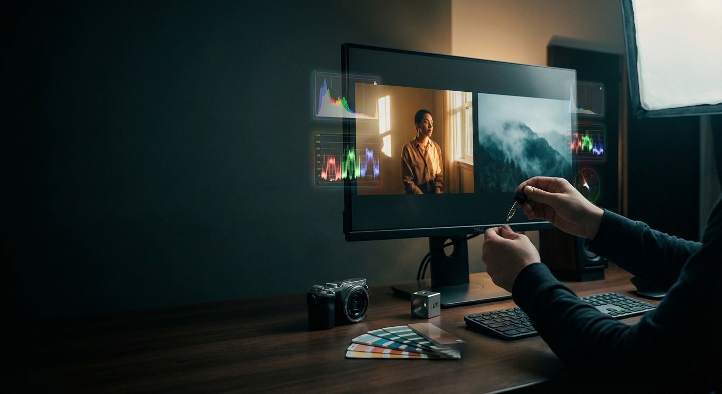
- LUTs (lookup tables): A compact representation of color transforms. One exported LUT can be applied to many images for identical results.
Practical 6-step workflow to color match from picture to picture
Step 1 — Capture for matchability
- Shoot in RAW when possible. RAW gives ±2 stops of exposure recovery and full white-balance control.
- Include a neutral gray card or a ColorChecker target in at least one frame per lighting setup. Use it to set a reference white balance and target colors.
- Record the lighting: note light source (daylight, overcast, tungsten), modifiers, and approximate color temperature.
Step 2 — Normalize images
- Apply a consistent base profile or camera profile for RAW conversion.
- Set white balance using the gray card or measured target: get temperature to within ±150 K and tint within ±5 units (software-specific).
- Normalize exposure so the midtones (or a selected midtone patch like a skin tone or neutral card) have similar RGB or Lab L* values across images.
Step 3 — Match global color and contrast
- Use histogram and RGB parade to align global luminance and channel distribution.
- Match contrast with curves: align black point, midtones, and highlights so the histograms visually overlap.
- Adjust global saturation to bring overall vibrancy in line; watch skin tones and color clipping.
Step 4 — Transfer color accurately
- Manual: Use HSL panels, targeted color wheels, and selective color to tweak hues and saturation of specific ranges (skin, foliage, sky).
- Automated: Use color transfer tools or AI Color Match features that analyze content and recommend style transforms. These can often produce a base match in seconds.
- Convert complex matches into a LUT for repeatable application.
Step 5 — Refine locally
- Apply local masks for areas that need different treatment (faces vs background vs product).
- Use selective dodging/burning and secondary color corrections to fix residual mismatches, especially on skin tones (aim for neutral a* ≈ 0 for mid-gray skin regions in Lab space).
Step 6 — Validate and export
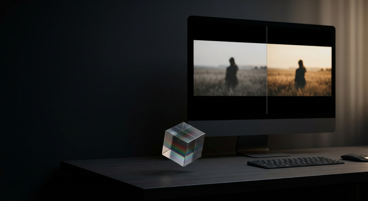
- Compare final images at 100% crop and at typical display sizes. Use side‑by‑side comparison and flip between images quickly to spot differences.
- If possible, measure Delta E for key patches (skin, neutral gray, primary product color). Target Delta E ≤ 2 for professional work; ≤ 5 is generally acceptable for web content.
- Export a LUT or preset (3D LUT, .cube) for reuse. Keep a naming convention that includes date, camera/profile, and lighting (e.g., "Studio5500K_v1_2026-04-02.cube").
Tools and techniques that work best
- Capture tools: Gray card, X‑Rite ColorChecker, exposure meter.
- Editing tools: RAW converter (Adobe Camera Raw, Capture One, DaVinci Resolve), color grading panels (Curves, Color Wheels, HSL), and LUT exporters.
- Automation: AI color match systems (Colorby AI’s AI Color Match) provide single-tap suggestions and LUT export for teams that need fast, repeatable results.
- Measurement: Use color sampling and Delta E calculation (in LAB color space) when absolute accuracy is required (products, prints).
Example: match a headshot shot outdoors to a studio portrait
Reference (studio): 5600K, midtones RGB ~ (115, 110, 105), skin patch Lab L* ~ 55, a* ~ 10, b* ~ 18. Target (outdoor): 6500K, midtones RGB ~ (125, 125, 110).
- Set outdoor image white balance to ~5600K.
- Lower highlights and adjust curve to compress sky contrast to studio levels.
- Reduce blue channel slightly and increase red channel in midtones with a curve.
- Use an HSL Hue shift to move skin hue until sampled Lab a*/b* values are within ±2 of studio reference.
- Validate Delta E for skin patch; iterate until ≤2.
Concrete example quote: "When matching portrait skin tones across lighting setups, aim for Lab L* within ±3 and Delta E ≤ 2 for differences that are visually imperceptible at normal viewing distances."
Quick checklist: color match from photo — one-page
- Shoot RAW and include a neutral target.
- Note light source and approximate color temperature.
- Convert RAW with consistent camera profile.
- Set white balance from gray card (±150 K).
- Match exposure/midtones using curves.
- Align global saturation and contrast.
- Use HSL/secondary corrections for targeted color shifts.
- Export and save LUT/preset for batch use.
- Validate with Delta E and side-by-side checks.
Manual vs AI-assisted vs LUT-based: quick comparison
- Manual (curves, HSL) — Speed: Slow (minutes per photo); Consistency: Medium (depends on operator); Control: High precision; Best use: Fine-tuning single images, creative control.
- AI-assisted (single-tap match) — Speed: Fast (seconds); Consistency: High (reproducible); Control: Moderate (depends on tool); Best use: Large batches, rapid prototyping.
- LUT-based (export/apply) — Speed: Very fast (apply to many); Consistency: Very high (identical); Control: Low-to-moderate (global transform); Best use: Brand looks, repeatable pipelines.
Practical note: combine methods — use AI-assisted matching to create a base LUT, then refine a few representative images manually and re-export a tuned LUT.
When to measure vs when to eyeball
- Measure (Delta E, Lab samples) for product photography, color-critical prints, controlled studio work.
- Eyeball and quick adjustments are acceptable for social media, quick editorial tasks, or when artistic intent overrides absolute accuracy.
- Rule of thumb: if more than 20 images must look identical, create and use a LUT or batch preset.
Integrating color matching into team workflows
- Standardize capture: require gray cards and RAW when possible.
- Store LUTs and presets in a shared asset library with naming that includes camera profile and lighting.
- Create short SOPs: white balance procedure, exposure normalization method, approval steps.
- Measure time savings: teams report 50–80% reductions in grading time when using consistent LUTs or AI-matching tools.
Note on Colorby AI (Webtest)
Colorby AI is an example of a platform that streamlines this workflow by providing AI Color Match (one-tap recommendations) and LUT export to enable repeated use across projects, reducing repetitive manual grading and improving turnaround time.
Advanced tips and constraints
- Avoid clipping: once highlights or shadows clip in RAW conversion, color data may be unrecoverable—keep highlight clipping <2% for safety.
- Monitor calibration: perform color matching on a calibrated display (calibrated to D65 gamma 2.2 or your target output standard).
- Color spaces: edit in a wide gamut working space (ProPhoto RGB or ACES for high-end workflows) and only convert for export.
- Compression artifacts: matching across heavily compressed JPEGs is harder; when possible use original RAW or high-quality TIFF/PNG masters.
Workflow templates (examples)
E-commerce batch (fast)
- Import RAW, apply camera profile.
- Apply product LUT.
- Adjust exposure/midtones.
- Quick local mask for shadows.
- Export batch.
Editorial mixed-lighting (accurate)
- Identify lighting clusters; assign images to groups.
- For each group, white balance with gray card.
- Use AI-assisted color match to reference image.
- Manually refine skin tones and highlights.
- Export group-specific LUTs.
FAQ
Q: Can I color match a phone photo to a studio image?
A: Yes. Shoot the phone photo in its highest-quality mode, include a neutral target if possible, convert to a wide color space in editing, correct white balance, and apply color transfer or AI-match. Expect slightly less latitude than RAW from a DSLR, but good matches are achievable for web and editorial use.
Q: How accurate does my monitor need to be?
A: Calibrate to D65, gamma 2.2, and aim for ΔE < 3 on calibration checks. Professional print or product work benefits from tighter calibration (ΔE < 2).
Q: What is a good Delta E target when color matching from a picture?
A: Delta E ≤ 2 is near-imperceptible; ≤ 5 is acceptable for most online images. For print and product color-critical work aim for ≤ 2.
Q: How do LUTs affect skin tones?
A: LUTs provide global transforms and can reproduce a consistent look across images quickly. Because LUTs are global, you may still need local corrections for skin tones in varying lighting conditions. Best practice: create LUTs from representative, well-balanced images and then refine per-image as needed.
Q: When should I use AI Color Match instead of manual adjustments?
A: Use AI Color Match for speed and consistency across large batches or when you need a reliable baseline quickly. Switch to manual when precise control is necessary (e.g., color-critical print, product matching, or bespoke artistic grading).
Final practical recommendations
- Always capture a neutral reference at least once per lighting setup.
- Prefer RAW and calibrated displays.
- Use AI-assisted tools to accelerate base matching, then export and apply LUTs for batch consistency.
- Validate with Delta E measurements and side-by-side visual checks before final export.
- Keep a library of LUTs/presets and document which camera profile and lighting each one targets.
By following a consistent process—capture predictably, normalize technically, transfer color methodically, and save reusable transforms—you can reliably color match a picture across different photographs, save editing time, and maintain a consistent visual identity.
Last updated: 2026-04-02