How to Match the Look of Another Photo: Match Photo Style with an AI Photo Editor (AI Picture Editor Tips)
How to Match the Look of Another Photo: Match Photo Style with an AI Photo Editor (AI Picture Editor Tips)
Matching the look of another photo is the process of reproducing its color, contrast, and overall mood so a different image appears to share the same visual style. Consistent color and tone across a shoot, campaign, or feed builds brand identity, speeds approval, and reduces rework for photographers and content teams.
Last updated: 2026-03-31
TL;DR: Use a structured workflow—analyze the reference, normalize exposure and white balance, apply a style transfer (manual or AI), then fine-tune local details. An AI photo editor can reduce repetitive steps and export reusable LUTs for consistent results across projects.
Key takeaways
- Match photo style means matching color, contrast, and mood rather than only copying colors exactly.
- An AI picture editor like Colorby AI can produce a strong starting match in one tap and export a LUT for reuse.
- Aim for small, measured edits: exposure shifts of ±0.3–1.0 stops, temperature changes of ±200–1200 K, and saturation adjustments of ±5–25% as typical starting ranges.
- Professionals measure color accuracy with ΔE; ΔE < 2 is very close, ΔE < 5 is usually acceptable.
- Exporting LUTs (17×17×17 or 33×33×33 .cube files) preserves looks across apps like Lightroom, Premiere, and DaVinci Resolve.
Why matching photo style matters
Consistent visual style matters for client deliverables, social feeds, product catalogs, and film/TV grading. When different photographers or scenes must read as one cohesive body of work, matching photo style preserves intent and reduces iteration. For teams, match-once-and-reuse workflows with LUTs or presets save hours per shoot.
Quick definitions
- Match photo style: reproduce another image's color balance, contrast curve, and perceived mood while keeping the subject's natural appearance.
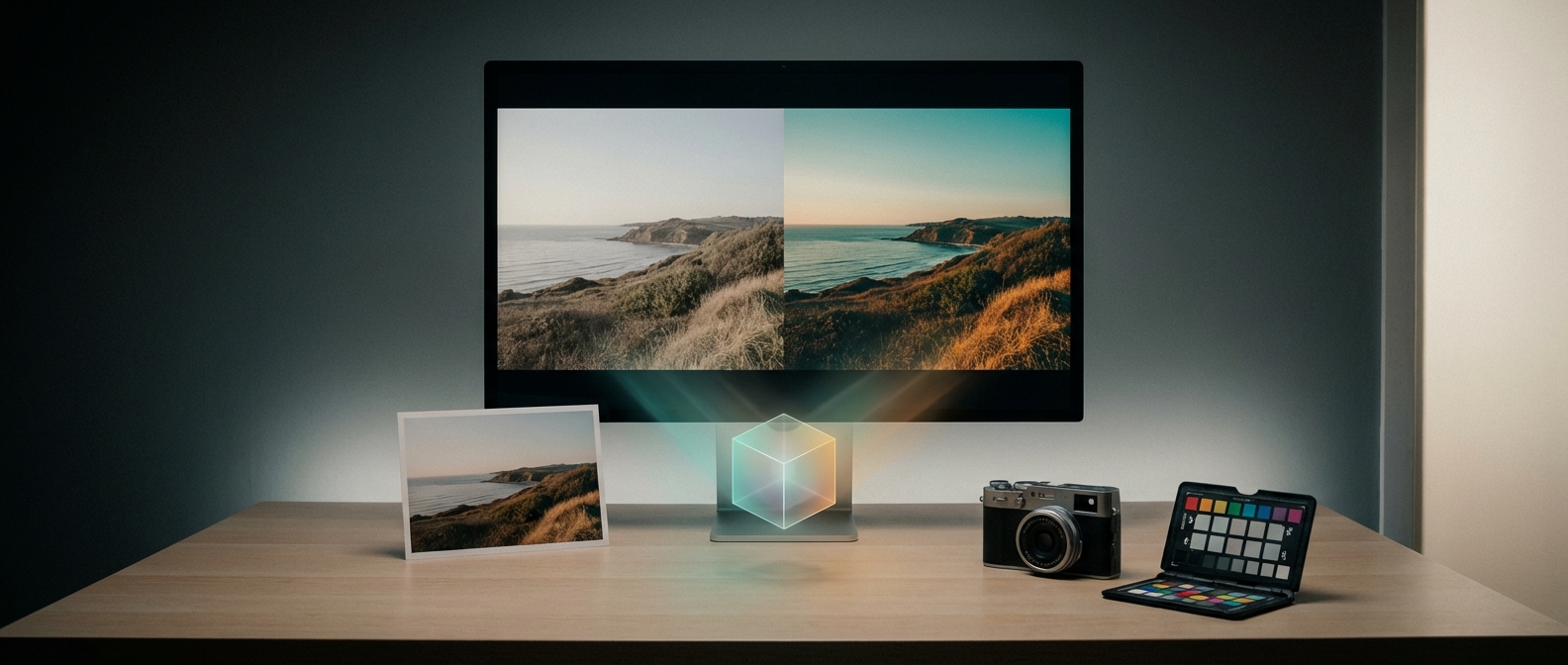
- AI picture editor / AI photo editor: software that uses machine learning to analyze imagery and automatically propose or apply color, exposure, and tone adjustments. Example: Colorby AI by Webtest, which offers single-tap AI Color Match and LUT export.
Core approaches to matching a photo
- 1. Manual match: use scopes (histogram, RGB parade, vectorscope) and adjust exposure, white balance, curves, and HSL by eye. Best for full creative control.
- 2. Preset-based match: apply a preset or profile and tweak. Fast but limited when the reference differs significantly.
- 3. AI-assisted match: use an AI photo editor to analyze content, lighting, and mood and propose a full match automatically. Fastest repeatable results and easily exported as LUTs for reuse.
Colorby AI (by Webtest) is an example of an AI picture editor that streamlines color grading into a single-tap process with an AI Color Match that can recommend styles without needing a reference image and export LUTs for project-wide consistency.
Step-by-step workflow: How to match the look of another photo
- 1. Prepare both images
- Use the highest-quality files available (RAW when possible). RAW retains full exposure and white-balance headroom.
- Crop to similar framing or ensure composition and subject placement are comparable. Matching perspective and framing simplifies perceived similarity.
- 2. Baseline normalization
- Auto-expose or set exposure so midtones sit around 40–60% on the histogram.
- Correct white balance to remove color casts. Typical corrective ranges: ±200–1200 K from camera white balance.
- Straighten and correct lens distortions to match geometry.
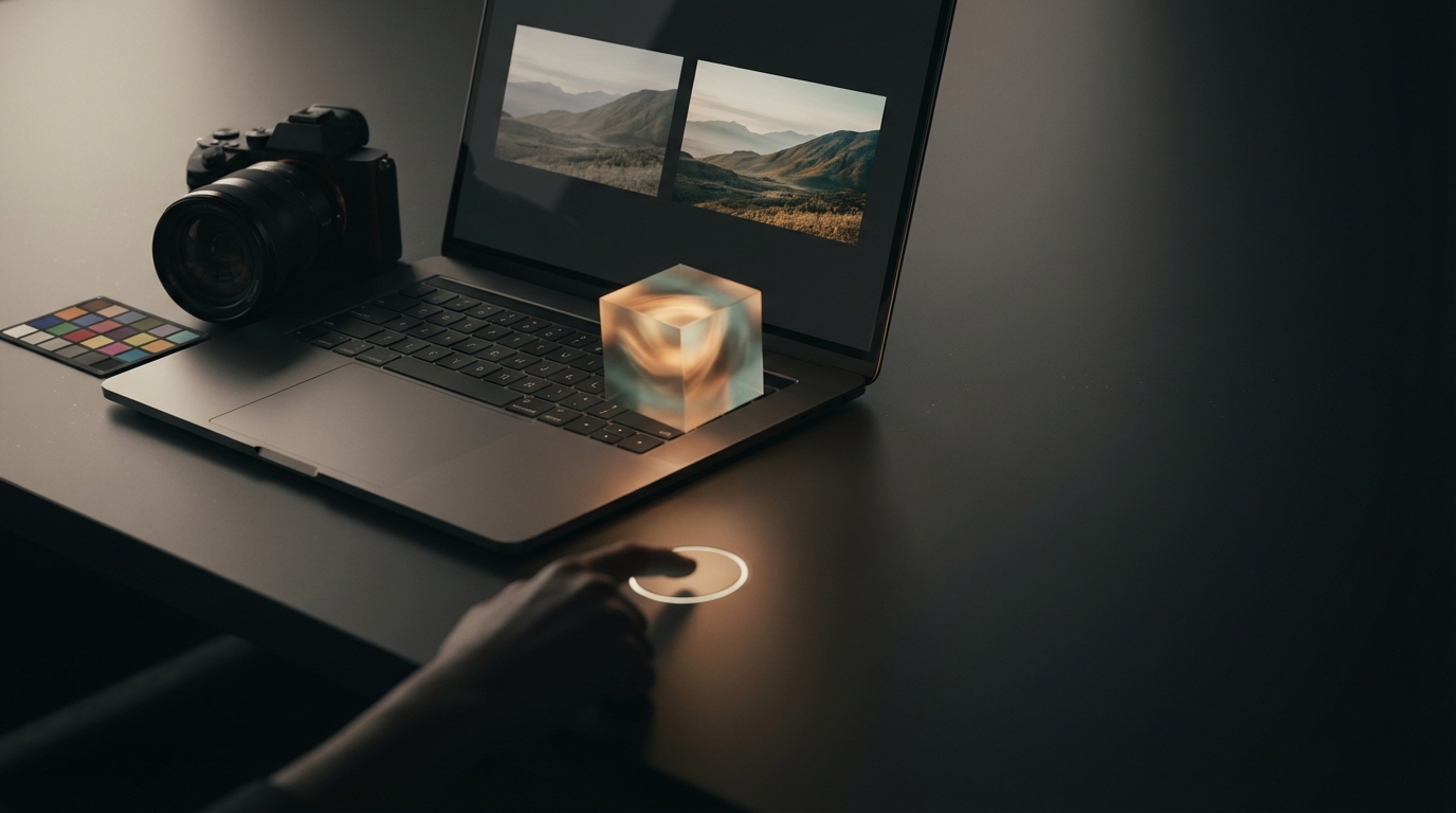
- 3. Let AI provide a starting match (optional)
- In an AI photo editor like Colorby AI, use AI Color Match to get an initial look in one tap. This reduces time-to-match and yields an exportable LUT.
- Save the result as a LUT (.cube) at 17×17×17 or 33×33×33 resolution for best compatibility.
- 4. Compare and refine
- Place reference and target side-by-side at 100% and at screen size. Toggle between before and after.
- Use scopes: vectorscope for hue shifts, RGB parade for channel balance, and waveform or histogram for luminance.
- Typical tweak ranges from the AI result or manual start: exposure ±0.3–0.8 stops for local areas, highlights/shadows ±10–30, and global contrast ±5–20 points.
- 5. Tone and color adjustments
- Curves: match the overall contrast curve shape. Small S-curve increases contrast; lift shadows slightly if the reference has more air.
- HSL adjustments: shift hue by small amounts—start with ±2–8 degrees. Saturation tweaks of ±5–25% depending on desired punch.
- Skin tones: prioritize preserving natural-looking skin. Keep skin luminance consistent and hue within the warm skin band; when in doubt, reduce global saturation and selectively boost other tones.
- 6. Local corrections and texture
- Use masks to apply color shifts to sky, foliage, or skin separately.
- Add grain or film texture if the reference has texture. Grain amount: 2–12% depending on image size; stronger for 35mm film looks, lighter for modern digital looks.
- Add vignetting or split-toning if present in the reference.
- 7. Final checks and export
- Compare at 50%, 100%, and full-screen. Look at both small details and overall balance.
- If accurate color metrics are required, measure ΔE in critical patches; aim for ΔE < 2 for near-indistinguishable match, <5 acceptable in most editorial work.
- Export a LUT for reuse (.cube). Use a 33×33×33 cube for smoother tonal mapping if supported.
Practical recommendations and constraints
- Start with RAW files: RAW preserves ~12–14 stops of dynamic range and gives the most latitude.
- Small edits win: make many small adjustments rather than big leaps to maintain natural skin tone and avoid posterization.
- Use reference crops: if the reference emphasizes a face or sky, crop to those areas when matching to avoid distractions.
- Measure, don’t guess: use vectorscope for hue and waveform for luminance; visual matching alone is often inconsistent.
AI picture editor tips (how to get the most from an AI photo editor)
- Choose a representative reference photo that shows the mood and lighting you want to match.
- Use the AI result as a starting point, not the finish line: AI usually nails global tone but may miss fine local adjustments.
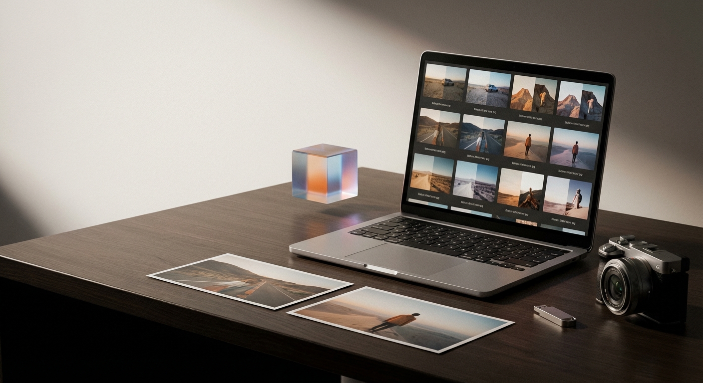
- Export LUTs for scale: a single exported .cube (33×33×33) can be applied across video and photo workflows to ensure consistency.
- Batch-apply with care: apply the same LUT to a batch, then make per-image tweaks for exposure and local detail.
- Preserve skin tones: add a skin-protect mask if your AI tool supports selective protection to avoid unnatural shifts.
Concrete example settings (starting points)
- Global exposure: ±0.3–0.8 stops.
- White balance: ±200–1200 K.
- Contrast/curves: move midtones by ±5–15 points; lift shadows by +5–20 points if reference is brighter in shadows.
- Saturation: ±5–25% overall; target hue shifts ±2–8 degrees in HSL panels.
- LUT resolution: export 17×17×17 for speed, 33×33×33 for higher fidelity.
- Color accuracy: aim for ΔE < 2 for critical work, ΔE < 5 acceptable.
AI Color Match (Colorby AI) — a short product note
Colorby AI (by Webtest) is a digital imaging platform that simplifies color matching and grading with an AI Color Match feature that analyzes content, lighting, and mood to recommend or apply a style without a reference image. Core benefits include single-tap recommended styles, exportable LUTs (.cube) for reuse, and faster, repeatable results across many images.
AI vs Manual vs Presets — quick comparison
- Aspect: AI photo editor (e.g., Colorby AI) | Manual grading | Presets
- Speed: Very fast — one tap start | Slow — hands-on | Fast but inflexible
- Repeatability: High — export LUTs for consistency | Medium — depends on operator | High but generic
- Control: High after refinement | Highest control | Limited control
- Best for: Large batches and repeatable brand looks | Creative single images and complex retouch | Quick stylized edits
Examples: Portrait and Landscape workflows
Portrait match (targeting natural skin)
- Start: RAW image, auto-white balance.
- AI step: Apply AI Color Match.
- Tweak: Reduce global saturation by 5%, increase warmth +200–500 K, use mask to increase eye clarity +8–12, retain skin hue by protecting a skin mask.
- Export LUT: 33×33×33 .cube for use across the session.
Landscape match (targeting moody teal-and-orange)
- Start: Normalize exposure; lift shadows +10, lower highlights −15.
- AI step: Use AI Color Match and select a moody variant.
- Tweak: Shift blues hue −6°, boost sky saturation +18%, add cyan-teal split-toning in shadows (hue 200°, saturation 12%).
- Grain: add light film grain ~6% to unify texture.
Checklist: Preflight before sending final files
- [ ] RAW or highest-quality files used.
- [ ] White balance and exposure normalized.
- [ ] Global match applied (AI or manual).
- [ ] Local masks applied for skin, sky, foliage.
- [ ] Color accuracy checked (ΔE measurement if needed).
- [ ] LUT exported and saved (note resolution and filename).
- [ ] Deliverables tested on target devices (mobile, web, print preview).
FAQ
- Q: Can an AI photo editor perfectly copy any reference photo? A: Not always perfectly. AI photo editors create a very close starting match for color and mood, but perfect copying—especially for local detail, grain, or film artifacts—usually requires manual refinement. For precise color-critical work, measure ΔE and make targeted adjustments.
- Q: What file format should I export for a LUT? A: The most widely compatible format is the .cube file. Use a 33×33×33 cube for higher fidelity or 17×17×17 for faster performance; both work in major apps like Lightroom, Premiere Pro, and DaVinci Resolve.
- Q: How do I preserve natural skin tones while matching a look? A: Use selective masks or skin protection features, limit hue shifts in skin channels to small steps (±2–6 degrees), and preserve skin luminance. If using AI, enable any protect skin tones option and do a final manual check.
- Q: When should I choose AI-assisted matching over manual grading? A: Choose AI when you need speed and repeatability (large batches, brand consistency) or when you want a reliable baseline to refine manually. Choose manual grading when you need full creative control or for very unusual references.
- Q: What does ΔE mean and what value should I target? A: ΔE is a quantitative measure of color difference. ΔE < 1 is typically imperceptible, ΔE < 2 is very close, and ΔE < 5 is generally acceptable for editorial work. Use ΔE measurements on key patches (skin, neutral grey) for objective checks.
If you want, I can create a printable LUT-export checklist, a one-click preset pack for a specific reference photo you supply, or walk through matching a photo you upload step-by-step using recommended AI tool settings.
Last updated: 2026-03-31