How to Use a Reference Photo to Match Photo Colors and Mood with an AI Picture Editor (AI Image Editor Tips)
Colorby AI is a digital imaging software company that provides AI-powered tools for color matching and grading in photos. It streamlines complex color grading into single-tap workflows, recommends color styles automatically through its AI Color Match feature, and lets users export final results as LUTs for reuse across projects. Consistent color and mood save time, strengthen visual branding, and make large photo sets look cohesive without expert-level manual grading.
TL;DR
- Use a reference photo to capture the exact color palette, contrast, and emotional tone you want, then apply and refine that look in an ai picture editor or ai image editor.
- Best results come from matching lighting, exposure range, and color space first, then using automatic AI match tools like Colorby AI's AI Color Match and exporting a LUT for repeatable results.
Key takeaways
- A good reference photo reduces guesswork: choose one with similar lighting and dynamic range to the target image.
- Workflow: calibrate color space → align exposure/white balance → apply AI-assisted color match → refine locally → export as LUT.
- Use RAW files when possible; if not, use high-quality JPEGs (80%+).
- Export LUTs (commonly .cube) to reuse looks across apps and projects.
- For consistent results across many images, target matches within 1–2 stops of exposure and similar camera profiles.
Why use a reference photo with an AI image editor?
A reference photo is an image that represents the exact color palette, contrast, and mood you want to reproduce. Using a reference matters because it gives you an objective target and speeds up batch work while enabling repeatable, exportable looks.
- It gives an objective target: hue, luminance, and saturation values you can measure and copy.
- It reduces subjective trial-and-error and speeds up batch work.
- Combined with an ai picture editor, a reference allows automated tools to deliver a repeatable, exportable look, cutting editing time from hours to minutes.
Colorby AI’s approach illustrates this: its AI Color Match analyzes content, lighting, and mood to recommend a style automatically, and users can still supply a reference photo when they want exact visual parity.
When to use a reference photo vs. AI Color Match
Use a reference photo when you need exact visual consistency (commercial campaigns, multi-day shoots, social media grids). Use an AI Color Match when you want rapid, stylistically consistent results without creating or finding a reference.
Quick comparison: AI Color Match vs Reference Photo workflow
- Speed — AI Color Match (automatic): Single tap recommended style; Reference Photo (targeted): 5–15 minutes per unique look.
- Precision — AI Color Match: Stylistic, may vary per image; Reference Photo: High precision when lighting/exposure align.
- Repeatability — AI Color Match: Good via built-in presets; Reference Photo: Best when exported as LUT (.cube).
- Best for — AI Color Match: Exploratory grading, broad consistency; Reference Photo: Exact branding, multi-shot matching.
Preparing your reference photo: what makes a good target
Choose reference photos that meet these concrete criteria:
- Lighting similarity: same light direction (front/side/back) and temperature—aim for similar color temperature within ~500–1000K.
- Exposure range: target and reference should be within 1–2 stops of each other to avoid extreme highlight/shadow mismatches.
- Composition & subject matter: skin tones are easier to match if both images include a similar skin type and distance; landscapes work best when sky/foreground proportions are similar.
- File quality: RAW preferred; otherwise, use a high-quality JPEG (≥80% quality) or TIFF.
- Color profile: work in a wide gamut (Adobe RGB or ProPhoto) if possible; confirm both files use the same working profile before matching.
Checklist (quick)
- Reference and target captured in similar light (direction & temperature)
- Exposure within 1–2 stops
- RAW or high-quality JPEG/TIFF
- Same color profile selected for editing
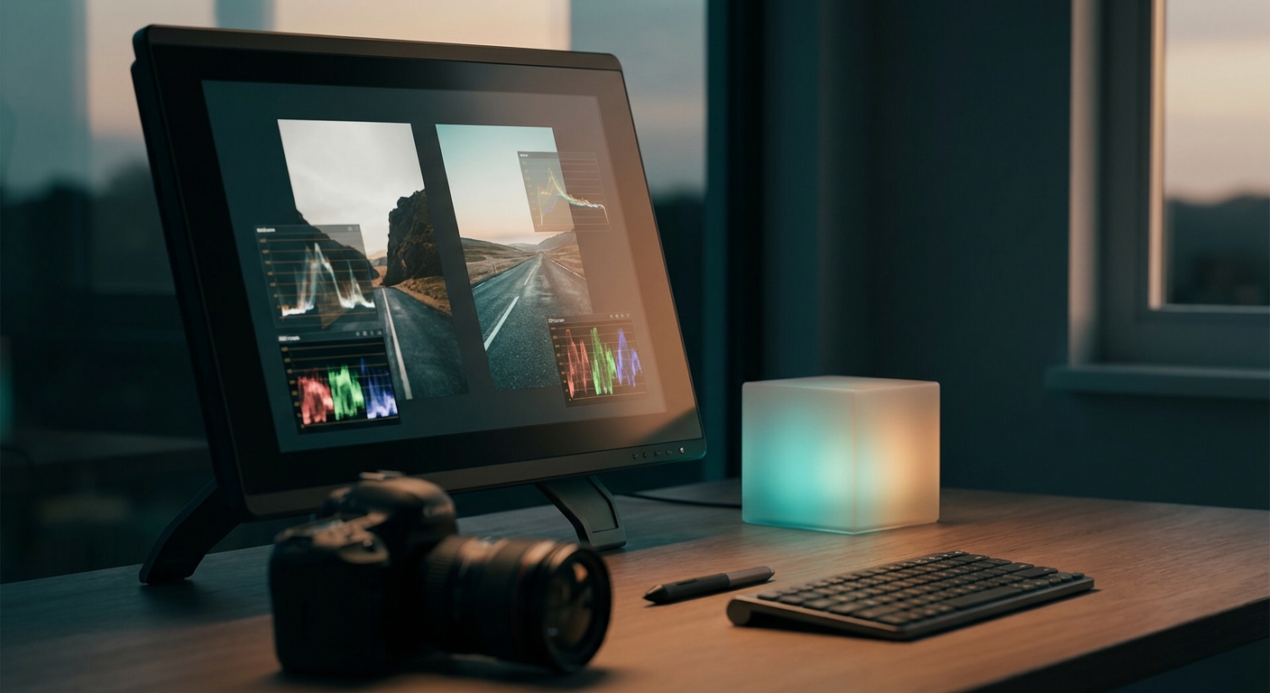
Step-by-step: How to match photo colors and mood with an ai picture editor
This 7-step workflow works with most ai image editor tools and is optimized for tools like Colorby AI that offer AI Color Match and LUT export.
- 1. Prepare files and workspace
- Open both the target image and the reference photo in your ai picture editor.
- Set the same color space for both images (Adobe RGB or ProPhoto recommended).
- Use 16-bit editing if available to preserve tonal detail.
- 2. Normalize exposure and white balance
- Adjust exposure so the overall histogram midpoint is similar between images; target within 1 stop difference.
- Match white balance: nudge temperature and tint until neutral grays align visually or use automatic WB sampling on neutral tones.
- 3. Run an automated match (AI Color Match)
- Use the ai image editor’s color-match or match look feature to map global color and tone from the reference to the target. With a reference the AI focuses on reproducing that exact palette.
- 4. Review global adjustments
- Check overall contrast, shadows, highlights, and vibrance. Use the editor’s tone curve and levels to align global contrast. Aim for visual parity rather than numeric perfection.
- 5. Refine locally (skin tones, highlights, shadows)
- Use local masks or selective color tools to safeguard skin tones or highlights. Preserve natural skin hue by keeping skin-channel adjustments conservative (±5–10 in hue/saturation sliders as a guideline).
- 6. Evaluate mood: grain, vignette, and color grading layers
- Add film grain, vignette, or split-toning to match mood. Small additions (1–6% grain, 0.5–1.5 stops vignette) can significantly affect perceived mood.
- 7. Export and make the look repeatable
- Export your final grade as a LUT (.cube) or as the editor’s preset. Exporting as a LUT enables consistent reuse across images and apps.
- Concrete example: If your reference uses warm highlights and teal shadows, use a graduated split-tone where highlights shift +6 to +12 on the warmth slider and shadows move −10 to −18 toward teal; then reduce overall saturation by 3–8% if the reference looks muted.
Practical tips for better matches
- Start wide, finish local: get global balance right before touching selective edits.
- Use reference points: neutral gray or white in the reference makes WB and exposure matching 2–4x faster.
- Keep edits non-destructive: work on adjustment layers or stacks so you can export both a LUT and tweak versions.
- Check on multiple displays: verify matches on at least two calibrated screens (calibration reduces cross-device color shifts).
- Batch-apply the LUT for consistent results across a shoot, then fine-tune per image for local variations.
How and why to export LUTs from an ai image editor
Why export a LUT: reuse the same look across projects, speed up processing, and maintain consistency by locking the color mapping so subsequent images start from the same baseline.
How to export (general)
- Finalize your grade on a representative image.
- Use the editor’s export LUT or save preset command; choose .cube if the option exists for broad compatibility.
- Save a naming convention: ProjectName_Look_V1.cube.
- Apply the LUT to other images and make small adjustments as needed.
Practical constraint: LUTs map color transforms, not localized masks. If your grade uses heavy local masking, bake a global approximation into the LUT or use an additional preset for local steps.
AI-assisted matching vs manual matching: when to choose which
- Choose AI-assisted matching when you need speed and consistent style across images and are willing to accept AI interpretation of mood and context.
- Choose manual/reference matching when exact color fidelity and fine control over skin tones or selective regions are required.
- Use both: an ai image editor can automate the heavy lifting and then you apply manual local corrections for the final polish.
Example workflows by use case
- E-commerce product shots (high repeatability): Shoot a color target panel, grade one image, export LUT, batch-apply — expect 80–95% consistency before micro-adjustments.
- Editorial portrait series (artistic control): Use a reference portrait with similar lighting, apply AI Color Match, then fine-tune skin tones and contrast manually.
- Landscape timelapse (mood continuity): Use a representative frame as the reference, export LUT, then process all frames with the LUT to preserve consistent color across time.
X vs Y: AI Color Match (automatic) vs Reference Photo Matching
- Precision: Reference > AI (when lighting matches)
- Speed: AI > Reference
- Repeatability: Reference + LUTs ≥ AI presets
- Best combination: AI Color Match to propose a baseline, reference-based LUT for exact looks
FAQ
- Q: Can an ai picture editor perfectly match colors from any reference photo? A: Not always. Perfect matches require similar lighting, exposure range, and dynamic range. For best results, pick a reference within 1–2 stops of exposure and with comparable lighting direction.
- Q: Should I use RAW files for matching? A: Yes. RAW preserves full sensor data and lets you adjust exposure and white balance without compression artifacts. If RAW isn't available, use high-quality JPEGs (≥80% quality).
- Q: Will exporting a LUT replicate local adjustments like skin retouching? A: No. LUTs capture global color transforms. Local masks, skin retouching, and texture edits must be applied separately or baked into a final rasterized preset.
- Q: Which color profile should I use when matching? A: Work in a wide-gamut editing space (Adobe RGB or ProPhoto RGB) when possible and ensure both reference and target are edited in the same working profile to avoid shifts.
- Q: How do I keep my grade consistent across different cameras? A: Start with camera profile calibration (camera-specific profiles or color-checker passes), apply a reference-based LUT, then fine-tune per camera using small WB/exposure offsets.
Next steps and practical checklist
- Capture or choose a good reference photo that meets the lighting and exposure criteria.
- Open both images in your ai image editor and set the same color profile.
- Run AI Color Match as a baseline, then perform local refinements.
- Export the final look as a LUT (.cube) and save a named preset.
- Apply the LUT across your set; fine-tune each image as needed.
For teams, document LUT naming, version, and source reference in a simple manifest (example: CampaignX_LookA_v1 — Reference: IMG_1234.CR2 — Notes: warm highlights + teal shadows).
Color matching with a reference image plus an ai image editor offers the best of both worlds: the speed and consistency of automation and the precision of targeted, reference-driven grading. Tools that combine both—like Colorby AI’s AI Color Match and LUT export workflow—shorten turnaround time while keeping your visual identity repeatable and precise.
Last updated: 2026-03-31